Poptops & Additions
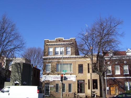
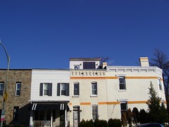
 Wandering around Monday, I took a lot of pictures of houses, looking for 3rd story additions, some that can be called poptops and other additions that possibly could have been added some time after the structure was initially built. That being, say a house was built in 1899, in 1930 maybe an addition was thrown on. As a disclaimer for several of the buildings I've labeled poptop in flickr, I don't know for sure if they all are additions. What I am focusing on is the difference in height between their neighbors, and how well or not they blend in.
 When I first saw the house at 435 S Street NW going up, I really didn't think anything nice looking would appear. Half right, half wrong. I was walking back from Thai X-ing walking down New Jersey Avenue at night, when I caught a glimpse of the rear of 435 with the lights burning through the large windows. I gasped at the beauty of it. It looked lovely. But the loveliness is limited to the back. The front, not as nice looking with the pedestrian looking vinyl siding and Home Depot door. Nothing that can't be later improved with stucco or brick tiles (or tiles) and a clear glass door.
 Typically, when these additions are reported they tend to be the ugliest of ugly. I don't believe they have to be that way. Third floor additions can be quite nice. My favorite add-on is near the corner of R & 5th, and it is the only one where I've been inside to take a look. As I remember, the designer/homeowner was an engineer by trade and German. The top floor was a bedroom with a bathroom in a box, in front of a small landing that led out to the deck, that overlooks 5th St. The bathroom in the box was novel, in that it did not go all the way to the ceiling letting the outside light go over it and in it.
We have to acknowledge that people want/need more space. One way to get more space is to move out to the 'burbs. Yet, this other way, adding on to the homes we already have, can be done well, and keeps people in the city. We should encourage good design, instead of dismissing ALL 3rd floor additions because too many lack the vision to do them well.
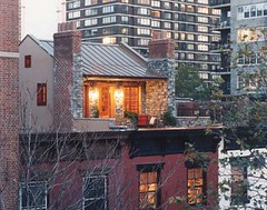
 Lastly, I leave you with this image spotted on the blog Desire to Inspire in their post about AJS Design in New York City. It's a little rooftop cabin. I think it is adorable.
Labels: houses


2 Comments:
That cabin is amazing. Way more creative than the stuff I see around here.
Thank you for pointing out that not all pop-ups are ugly! So many historic districts are unnecessarily alarmed by additions, some to the point of considering banning them through zoning law changes. Let's hope reason prevails.
Post a Comment
Links to this post:
Create a Link
<< Home